
Advanced HTML · 3 min read
Forms and Native Validation
Input types, constraint attributes, the Constraint Validation API, custom messages, and accessible errors.
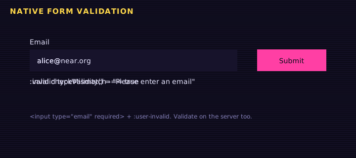
Browsers ship a complete validation engine. Use the right type and a few attributes and you get mobile keyboards, error bubbles and :invalid styles without a single library.
Constraint attributes
| Attribute | Example | Failing state (validity.*) |
|---|---|---|
required | <input required> | valueMissing |
type | type="email", type="url" | typeMismatch |
pattern | pattern="[a-z0-9_-]+\.testnet" | patternMismatch |
minlength / maxlength | minlength="2" | tooShort / tooLong |
min / max / step | type="number" min="0" step="0.01" | rangeUnderflow, stepMismatch |
The Constraint Validation API
Every form control has validity, checkValidity(), reportValidity() and setCustomValidity(message). A non-empty custom message makes the field invalid until you clear it with "".
<form id="f" novalidate>
<label for="acct">Testnet account</label>
<input id="acct" name="acct" required pattern="[a-z0-9_-]{2,48}\.testnet"
       aria-describedby="acct-err" placeholder="alice.testnet">
<p id="acct-err" class="err" aria-live="polite"></p>

<label for="email">Email</label>
<input id="email" type="email" required aria-describedby="email-err">
<p id="email-err" class="err" aria-live="polite"></p>

<label for="pw">Password</label>
<input id="pw" type="password" required minlength="10">
<label for="pw2">Repeat password</label>
<input id="pw2" type="password" required aria-describedby="pw2-err">
<p id="pw2-err" class="err" aria-live="polite"></p>

<button>Create account</button>
<p id="ok"></p>
</form>
Edit this example in the Playground.
Things to notice:
novalidateturns off the default bubbles so we render messages, but the validity state still works.:user-invalidonly styles a field after the user interacted with it, so the form does not start out red.- Errors are linked with
aria-describedbyand announced througharia-live. - On failure, focus moves to the first bad field.
Autocomplete and input modes
autocomplete="email", autocomplete="new-password" and inputmode="decimal" help password managers and mobile keyboards. They are free usability wins.
Summary
Pick precise input types, declare constraints as attributes, read validity for messages, use setCustomValidity for cross-field rules, and always validate again on the server.
Saved in this browser.