
Advanced HTML · 3 min read
Semantics and Accessibility
Landmarks, heading order, accessible names, ARIA only when needed, and keyboard focus.
Browsers build two trees from your HTML: the DOM, and the accessibility tree that screen readers, voice control and switch devices use. Semantic elements put real meaning into that second tree for free. A <div onclick> gives it nothing.
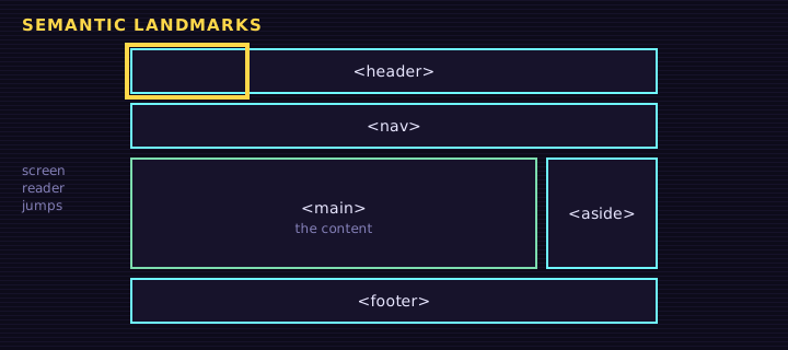
Landmarks
Each landmark element maps to an ARIA role automatically:
| Element | Implicit role | Use it for |
|---|---|---|
<header> (top level) | banner | Site logo and title |
<nav> | navigation | Main or section navigation |
<main> | main | The one primary content area per page |
<aside> | complementary | Related, skippable content |
<footer> (top level) | contentinfo | Copyright, legal, contacts |
<section> with a heading | region | A themed group with a name |
Headings are an outline
Screen reader users often navigate by heading. Use one <h1>, then never skip levels on the way down (h2 → h3, not h2 → h4). Pick the level by structure, then style the size with CSS.
Accessible names
Every interactive control needs a name the browser can announce:
html
<!-- visible text is the name -->
<button>Mint diploma</button>

<!-- icon-only button: give it a name -->
<button aria-label="Close dialog"><svg aria-hidden="true">...</svg></button>

<!-- inputs get their name from a label -->
<label for="acct">NEAR account</label>
<input id="acct" name="acct">Keyboard focus
Everything clickable must be reachable with Tab and visible when focused. Never remove outlines without a replacement:
<a class="skip" href="#main">Skip to content</a>
<header><strong>Retr0 Demo</strong></header>
<nav aria-label="Main">
<a href="#">Courses</a> <a href="#">Playground</a>
</nav>
<main id="main">
<h1>Courses</h1>
<section aria-labelledby="near-h">
  <h2 id="near-h">NEAR</h2>
  <button aria-expanded="false" aria-controls="near-more" id="toggle">Show lessons</button>
  <ul id="near-more" hidden>
    <li>Accounts and keys</li>
    <li>Smart contracts</li>
  </ul>
</section>
</main>
Edit this example in the Playground.
Press Tab inside the preview: the hidden "Skip to content" link appears first, then focus moves with a clear yellow ring. aria-expanded tells assistive tech whether the list is open.
Images and alt text
- Informative image: describe what matters (
alt="Diploma NFT for alice.testnet, score 38/40"). - Decorative image: empty alt (
alt="") so it is skipped. - Never write "image of"; the screen reader already says it is an image.
Checklist
- Landmarks: one
main, labellednavelements. - Headings in order.
- Every control has a name; icon buttons use
aria-label. - Visible
:focus-visiblestyles. - Color contrast of at least 4.5:1 for body text.
Summary
Semantic HTML is the cheapest accessibility work you will ever do. Reach for native elements first, add ARIA only to describe state (aria-expanded, aria-current) or to name things, and test with the keyboard.
Saved in this browser.