
Advanced CSS · 2 min read
Grid and Flexbox Layouts
When to use Grid vs Flexbox, named areas, auto-fit with minmax, alignment, and combining both.
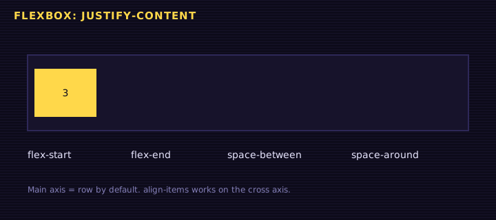
Flexbox is one-dimensional: it distributes items along a single axis and lets content decide sizes. Grid is two-dimensional: you define rows and columns first, then place items into them. Real layouts use both: Grid for the page skeleton, Flexbox inside components.
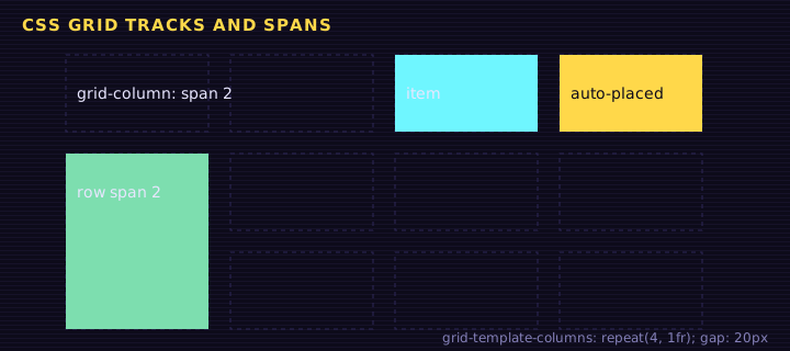
Named grid areas
grid-template-areas lets you draw the layout in ASCII and rearrange it per breakpoint without touching the HTML:
<div class="app">
<header>Header</header>
<nav>Nav</nav>
<main>
  <div class="cards">
    <article>Lessons 12</article><article>Quiz 92%</article>
    <article>Diploma</article><article>Streak 5</article>
  </div>
</main>
<aside>Leaderboard</aside>
<footer>Footer</footer>
</div>
Edit this example in the Playground.
auto-fit + minmax: responsive without media queries
repeat(auto-fit, minmax(140px, 1fr)) means: fit as many columns as possible, each at least 140px, then stretch them equally. Resize the preview and the cards reflow on their own.
| Keyword | Empty tracks |
|---|---|
auto-fill | Kept, so items stay at their minimum width |
auto-fit | Collapsed, so items stretch to fill the row |
Flexbox inside components
<div class="bar">
<strong>Retr0</strong>
<a href="#">Learn</a><a href="#">Playground</a>
<button class="push">Connect</button>
</div>
<div class="media">
<div class="avatar"></div>
<p>Flex items shrink and wrap. <code>min-width: 0</code> lets long text truncate instead of overflowing.</p>
</div>
Edit this example in the Playground.
Decision guide
- Laying out the page or a 2D gallery? Grid.
- Aligning items in a row (nav, toolbar, button group)? Flexbox.
- Need items in different rows to line up in columns? Grid (or
subgrid). - Centering one thing? Either:
display: grid; place-items: center.
Summary
Grid defines tracks and places items in two dimensions; named areas make responsive rearrangement trivial. Flexbox shares space along one axis. Combine them: Grid for structure, Flexbox for components.
Saved in this browser.