
Advanced CSS · 2 min read
Responsive Design and Container Queries
Mobile-first media queries, fluid type with clamp(), container queries, and modern viewport units.
Responsive design used to mean one thing: media queries on the viewport. Modern CSS adds fluid values and container queries, so components adapt to the space they are actually given.
Mobile-first media queries
Write the single-column mobile layout as the default, then add complexity as space grows:
css
.grid { display: grid; gap: 1rem; }
@media (min-width: 48rem) { .grid { grid-template-columns: 1fr 1fr; } }
@media (min-width: 72rem) { .grid { grid-template-columns: repeat(3, 1fr); } }
Other useful media features: (hover: hover) for devices with a real pointer, (prefers-color-scheme: dark), and (prefers-reduced-motion: reduce).
Fluid values with clamp()
clamp(min, preferred, max) scales smoothly between limits:
css
h1 { font-size: clamp(1.5rem, 1rem + 3vw, 3.5rem); }
.section { padding-block: clamp(2rem, 6vw, 6rem); }
The hero title on this site's home page uses exactly this technique.
Container queries
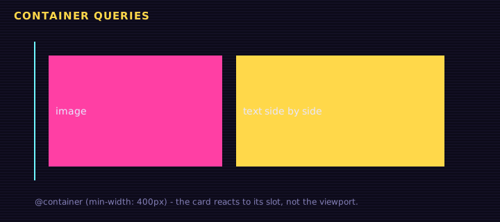
A card in a narrow sidebar and the same card in a wide main column need different layouts at the same viewport width. Media queries cannot tell them apart; container queries can.
<div class="layout">
<aside class="slot"><div class="card"><div class="img"></div><div><h3>Tokens and NFTs</h3><p>NEP-141 and NEP-171 on NEAR.</p></div></div></aside>
<main class="slot"><div class="card"><div class="img"></div><div><h3>Tokens and NFTs</h3><p>NEP-141 and NEP-171 on NEAR.</p></div></div></main>
</div>
<p>Drag the slider to resize the main slot:</p>
<input id="w" type="range" min="200" max="700" value="520">
Edit this example in the Playground.
Key points:
container-type: inline-sizemakes an element a query container for its width.@container slot (min-width: 400px)styles descendants based on that container.- Container query units like
cqi(1% of the container's inline size) enable fluid sizing within components.
Modern viewport units
On mobile, 100vh includes the area under the browser's toolbars. Use 100dvh (dynamic), 100svh (smallest) or 100lvh (largest) instead.
Summary
Start mobile-first, make values fluid with clamp(), use media queries for page-level layout and user preferences, and container queries for reusable components that must fit any slot.
Saved in this browser.