
CSS · 2 min read
The Box Model
Every element is a box. Learn content, padding, border, and margin, plus box-sizing and display.
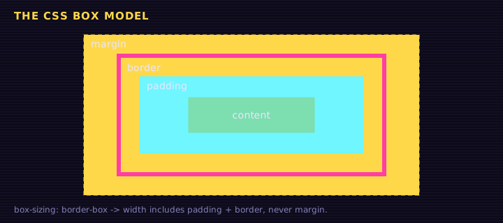
In CSS, every element is a rectangular box. Understanding that box is the single most important step to controlling layout.
From the inside out, each box has:
- Content: the text or image itself (
widthandheight) - Padding: space between the content and the border (inside the box)
- Border: a line around the padding
- Margin: space outside the border, pushing other elements away
css
.box {
  width: 200px;
  padding: 20px;
  border: 4px solid #1572B6;
  margin: 30px;
}<div class="box">I am a box. Inspect me in DevTools!</div>
<div class="box">Another box.</div>Edit this example in the Playground.
Open DevTools and hover over a box: the browser highlights content, padding, border, and margin in different colors.
Shorthand for sides
css
margin: 10px;                /* all four sides */
margin: 10px 20px;           /* top & bottom | left & right */
margin: 10px 20px 30px;      /* top | left & right | bottom */
margin: 10px 20px 30px 40px; /* top | right | bottom | left (clockwise) */
margin-top: 5px;             /* just one side */
Padding works exactly the same way.
box-sizing: the most useful reset
By default, width sets only the content width. Padding and border are added on top, so a width: 200px box with 20px padding and a 4px border is actually 248px wide. Confusing!
box-sizing: border-box makes width include padding and border:
css
*, *::before, *::after {
  box-sizing: border-box;
}Borders and rounded corners
css
.card {
  border: 2px dashed hotpink;   /* width style color */
  border-radius: 12px;          /* rounded corners */
}
.avatar { border-radius: 50%; } /* a perfect circle (on a square) */
Centering a block
A block with a set width can be centered horizontally with auto margins:
css
.container {
  max-width: 960px;
  margin: 0 auto;
}
Margin collapse
When two vertical margins touch, they collapse into one, using the larger value. A paragraph with margin-bottom: 20px followed by one with margin-top: 30px ends up 30px apart, not 50px.
The display property
display changes how a box behaves in the layout:
| Value | Behavior |
|---|---|
block | Starts on a new line, takes full width (div, p, h1) |
inline | Flows within text; width/height are ignored (span, a) |
inline-block | Flows within text but respects width/height |
none | Removed from the page entirely |
flex / grid | Turns the box into a layout container (next lessons!) |
<p>Some <span class="pill">inline-block</span> pills inside a <span class="pill">sentence</span> of text.</p>
<div class="hidden">You cannot see me.</div>
Edit this example in the Playground.
Summary
- Every element is a box: content, padding, border, margin.
- Use
box-sizing: border-boxso widths include padding and border. - Shorthands go clockwise: top, right, bottom, left.
displaycontrols whether a box is block, inline, hidden, or a layout container.
Saved in this browser.