
CSS · 2 min read
CSS Grid
Build two-dimensional layouts with rows and columns using CSS Grid.
Flexbox handles one direction at a time. CSS Grid handles rows and columns together, which makes it perfect for whole page layouts, galleries, and dashboards.
Define a grid
css
.grid {
  display: grid;
  grid-template-columns: 200px 1fr 1fr;
  grid-template-rows: auto 300px;
  gap: 16px;
}grid-template-columnsdefines the columns. Here: one 200px column and two flexible ones.frmeans "fraction of the remaining space".1fr 2frgives the second column twice as much as the first.gapsets the space between rows and columns.
repeat() and minmax()
css
grid-template-columns: repeat(3, 1fr);          /* three equal columns */
grid-template-columns: repeat(4, minmax(150px, 1fr));
The responsive card grid
This one line creates a grid that fits as many columns as possible, each at least 180px wide, with no media queries:
css
.cards {
  display: grid;
  grid-template-columns: repeat(auto-fit, minmax(180px, 1fr));
  gap: 16px;
}<div class="cards">
<div class="card">🧱 HTML</div>
<div class="card">🎨 CSS</div>
<div class="card">⚡ JavaScript</div>
<div class="card">⛓️ Web3</div>
<div class="card">🧪 Quizzes</div>
<div class="card">🏆 Projects</div>
</div>
<p>Resize the preview to watch the columns change automatically.</p>Edit this example in the Playground.
Placing items
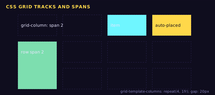
Grid lines are numbered starting at 1. Items can span across lines:
css
.featured {
  grid-column: 1 / 3;     /* from line 1 to line 3: spans 2 columns */
  grid-row: span 2;       /* spans 2 rows */
}
.full-width { grid-column: 1 / -1; } /* -1 means the last line */
Named areas
grid-template-areas lets you draw your layout with words:
<div class="page">
<header>Header</header>
<nav>Sidebar</nav>
<main>Main content</main>
<footer>Footer</footer>
</div>
Edit this example in the Playground.
Try rewriting the areas, for example put the sidebar on the right: "main nav".
Alignment in Grid
css
.grid {
  justify-items: center;  /* horizontal alignment inside each cell */
  align-items: center;    /* vertical alignment inside each cell */
  place-items: center;    /* shorthand for both */
}Summary
display: gridwithgrid-template-columnsandgrid-template-rowsdefines the grid.fr,repeat(), andminmax()make flexible tracks.repeat(auto-fit, minmax(...))creates responsive grids with no media queries.- Place items with line numbers or named
grid-template-areas.
Saved in this browser.