
CSS · 2 min read
Flexbox
Lay out items in a row or column, align them, and distribute space with CSS Flexbox.
Flexbox is a one-dimensional layout system: it arranges items in a row or a column, and makes aligning and spacing them easy. Navbars, button groups, cards in a row, and perfectly centered content are all classic Flexbox jobs.
Turn it on
css
.container {
  display: flex;
}
The element with display: flex is the flex container; its direct children become flex items.
The two axes
- The main axis follows
flex-direction(horizontal forrow, the default). - The cross axis runs perpendicular to it.
css
.container {
  flex-direction: row;       /* row | row-reverse | column | column-reverse */
  justify-content: center;   /* alignment on the main axis */
  align-items: center;       /* alignment on the cross axis */
  gap: 16px;                 /* space between items */
  flex-wrap: wrap;           /* allow items to wrap onto new lines */
}
justify-content values
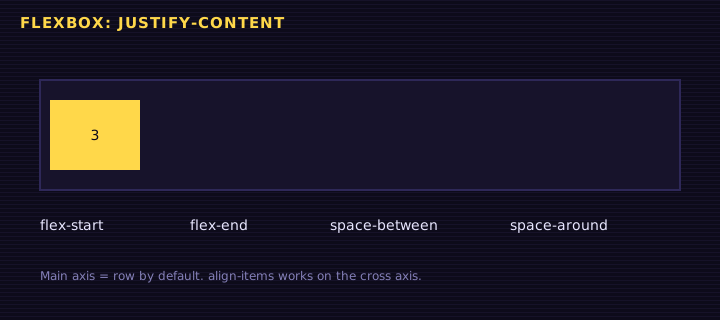
flex-start, center, flex-end, space-between, space-around, space-evenly
align-items values
stretch (default), flex-start, center, flex-end, baseline
<div class="row">
<div class="item">1</div>
<div class="item">2</div>
<div class="item">3</div>
</div>
<p>Change justify-content to space-between, flex-end, or space-evenly. Try flex-direction: column!</p>
Edit this example in the Playground.
Perfect centering
The famous "how do I center a div?" question has a two-line answer:
css
.parent {
  display: flex;
  justify-content: center;
  align-items: center;
}
Growing and shrinking items
Flex items have three properties that control their size:
css
.item {
  flex-grow: 1;     /* how much of the extra space this item takes */
  flex-shrink: 1;   /* how much it shrinks when space is tight */
  flex-basis: 200px;/* its starting size before growing or shrinking */
}

/* Shorthand: grow shrink basis */
.item { flex: 1 1 200px; }
.sidebar { flex: 0 0 250px; } /* fixed 250px, never grows or shrinks */
.content { flex: 1; }         /* takes all remaining space */
Try it: a responsive navbar
<nav class="nav">
<a class="logo" href="#">Retr0 Academy</a>
<ul class="links">
  <li><a href="#">HTML</a></li>
  <li><a href="#">CSS</a></li>
  <li><a href="#">JS</a></li>
</ul>
<button>Sign in</button>
</nav>
Edit this example in the Playground.
Item-level alignment and order
css
.special { align-self: flex-end; } /* override align-items for one item */
.first { order: -1; } /* visually move an item first */Summary
display: flexcreates a flex container; its children become flex items.justify-contentaligns on the main axis,align-itemson the cross axis.gapadds space between items;flex-wrap: wrapallows wrapping.flex: grow shrink basiscontrols how items share space.
Saved in this browser.